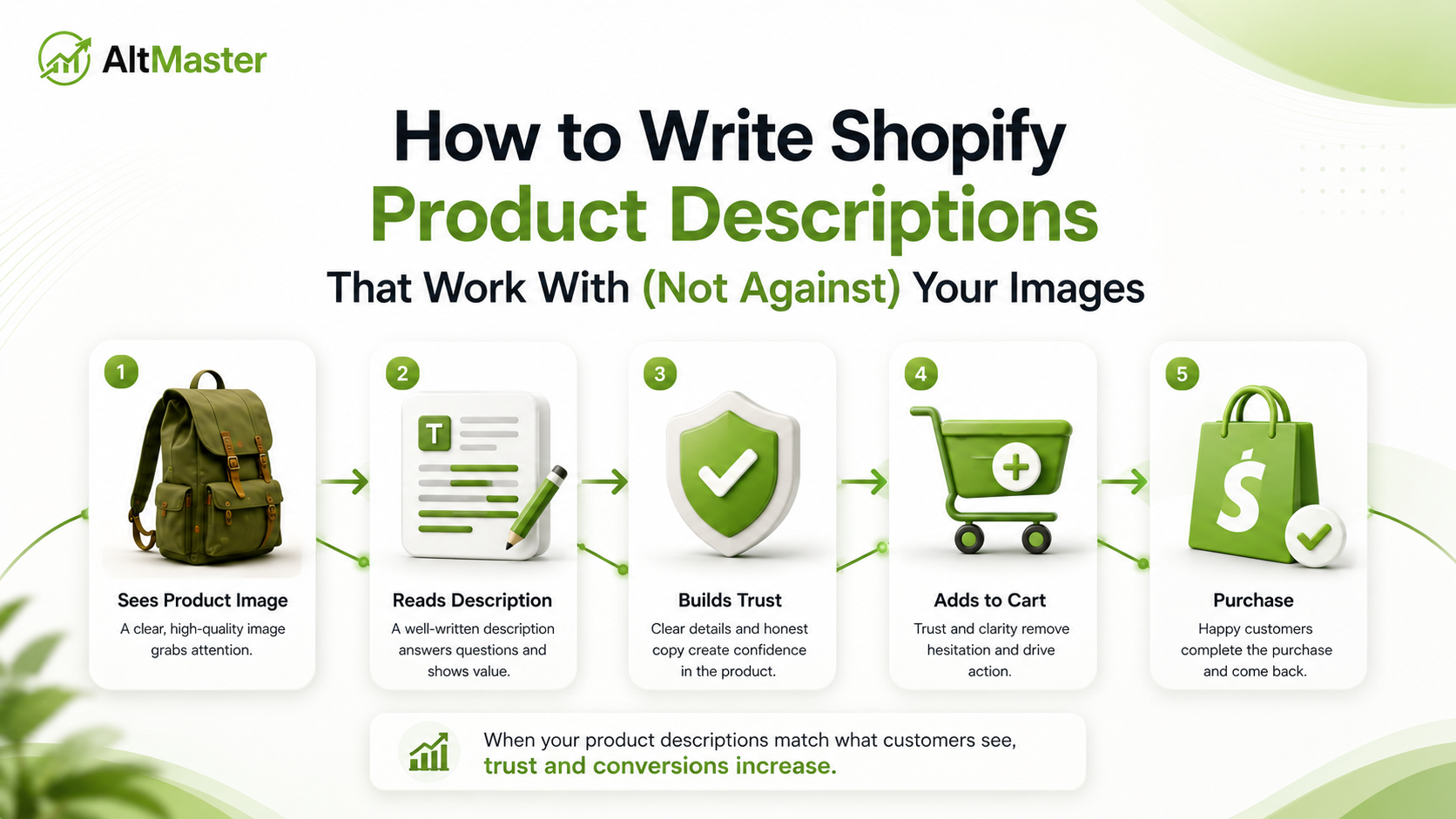
Most Shopify store owners treat product descriptions and product images as separate tasks. The photographer handles the images. The copywriter handles the description. They go live on the same page - and nobody checks whether they're actually working together.
The problem is Google doesn't treat them separately. It reads both and looks for consistency. A product page where the copy, the image ALT text, and the file names all point to the same specific thing - same color, same material, same use case - gets a coherent signal Google can evaluate and rank confidently. A page where the description says "sage green" and the image ALT text says "green shirt" and the file name says "IMG_4821.jpg" sends three different signals that partially contradict each other.
That inconsistency is quiet. It doesn't trigger an error anywhere. But it costs you ranking, and it compounds across every product in your catalog.
Why Your Product Description and Images Need to Tell the Same Story
The biggest shift in product page SEO in 2026 is the move from keyword-focused pages to product-data-focused pages - search engines want complete, accurate, and consistent product information. That consistency isn't just about using the right keywords. It's about every content layer on the page - title, description, image ALT text, file name, structured data - describing the same product in compatible language.
Product pages with complete, consistent data across all signals convert better and rank higher; incomplete or inconsistent data creates both a search problem and a revenue problem. A shopper who lands on your product page because they searched "handmade ceramic mug with speckled glaze" and finds a description that reads "premium artisan stoneware drinkware" experiences a subtle disconnect - the words don't match what they searched for, and that friction, however small, affects bounce rate, time on page, and ultimately, whether they buy.
The Relationship Between Product Copy & Image SEO
How Google Reads Your Description and Images Together
When Google crawls a product page, it's not evaluating your copy and your images independently. It's building a unified picture of what the page is about by reading every content signal in context. Body paragraphs within one scroll-length of the image provide supporting semantic context, and page title and meta description provide broader topic framing that Google uses to disambiguate images that could fit multiple topics.
In practical terms: the paragraph describing your product's material sits physically close to the image of that material. Google reads both. If the paragraph says "hand-thrown ceramic with an off-white speckled finish" and the nearby image ALT text says "handmade ceramic mug with speckled off-white glaze," those two signals reinforce each other. Google's confidence in what the page is about increases - and so does its confidence in ranking the page for searches that include those descriptors.
Why Mismatched Copy & Images Confuse Search Engines
The mismatch problem shows up most often in three patterns:
Generic image metadata against specific copy. The description carefully calls out "slate blue" and "Japanese indigo linen," while the ALT text for every image just says "men's shirt." The copy is doing work the images aren't reinforcing.
Brand language in copy, search language in images. Your description calls it "The Coastal Breeze Top" but the ALT text says "women's linen button-down shirt in sage green." Neither is wrong, but they're not building the same signal - and Google has to guess which language to trust for ranking.
Variant-specific copy against shared image metadata. You wrote a color-specific sentence in the description for the sage green variant, but all six color-variant images share the same ALT text copied from the main product. The copy differentiates; the images don't.
How to Structure Product Descriptions Around Your Images
Matching Your Copy Sequence to Your Image Order
A standard product image set follows a logical order: hero shot, secondary angles, detail close-ups, lifestyle image. Your description should follow the same sequence - not rigidly, but naturally.
Open with the product overview that matches what the hero image shows. Move to specific features that match what your detail shots are showing. Close with use-case or lifestyle language that mirrors your lifestyle image. A reader who scrolls through your images while reading your description should feel like the two are narrating the same thing - because that's what tells Google they are.
In practice, this looks like: "The Coastal Linen Shirt comes in a relaxed, open-collar cut that drapes cleanly on the shoulder" - paired with a front-view hero image ALT text that reads Relaxed-fit linen shirt in sage green – open collar – front view. Same language, two content layers, one consistent signal.
Using Variant-Specific Language That Mirrors Your ALT Text
This is the most overlooked alignment opportunity on Shopify stores. When a product comes in multiple colors or materials, each variant page has a slightly different version of the description that calls out that specific color - and each variant image should have ALT text that reflects the same color.
If your sage green variant description says "The sage green colorway is a muted, earthy tone that works for both casual weekend wear and relaxed office settings", the ALT text on the sage green variant images should use the same specific language: Relaxed-fit linen shirt in sage green – casual fit – front view. Not green shirt. Not linen shirt – front view. Sage green, specifically, matching the language in the copy.
How long-tail ALT text captures the niche searches that broad product titles miss covers why this variant-level specificity compounds into meaningful ranking differences - each color variant with aligned copy and ALT text becomes a separate long-tail search target, not just a visual option within a shared product page.
Writing Copy That Reinforces Your Image Keywords Naturally
How to Weave ALT Text Keywords Into Product Descriptions
The goal isn't to copy-paste your ALT text into the description - that would read mechanically and serve no one. The goal is to use the same specific descriptors in both, in language that sounds natural in each context.
When writing body copy for pages with SEO-targeted images, describe the image naturally in the adjacent paragraph - don't force keyword-stuffed references, but do use natural language that confirms and extends the ALT text's description. An image ALT text of Handmade ceramic mug with speckled off-white glaze - 12oz - top-down view should sit near a paragraph that naturally mentions the glaze finish, the capacity, and the handmade production - not as a list of attributes, but woven into language that helps a buyer make a decision.
A practical method: write your ALT text first using the formula product name + color or material + view or context, then use those same descriptors as anchors when writing the adjacent copy. The words don't have to be identical - they just need to belong to the same semantic neighborhood. "Hand-thrown," "speckled glaze," "off-white finish" in the copy next to an image ALT text containing "speckled off-white glaze" are consistent. "Premium artisan drinkware" next to the same ALT text is not. For the full ALT text formula with templates across every image type, the AltMaster guide to writing SEO-optimized ALT text for Shopify product images is the reference worth bookmarking before you write a word of copy.
This is also where AltMaster makes copy-image alignment practical at scale. It generates ALT text using your actual product data variables - product title, variant color, material, product type - which means the language in your ALT text is anchored to the same data your product descriptions are built from. When your copy says "slim-fit linen shirt in navy blue" and your ALT text says Slim-fit linen shirt in navy blue – front view, that consistency isn't something you had to manually coordinate across 200 products. The template did it for you, across every product and every variant in your catalog.
The Most Common Copy & Image Mismatches Shopify Stores Make
Using brand names in copy but generic terms in ALT text. Your description calls it "The Havana Chair" but your ALT text says "rattan chair." Google indexes both - but a shopper searching "natural rattan accent chair for living room" will find the ALT text, not the brand name. Use the descriptive language in both.
Writing one description for all variants. If a product comes in six colors and every variant shares the same description with a single color swap in one sentence, most of the copy isn't specific to what's shown in the variant images. Write a short variant-specific section for each color or material that mirrors the ALT text language for those specific images.
Ignoring what the detail shots are actually showing. A detail shot of a brass zip closure gets an ALT text of bag detail. The description never mentions the closure at all. A shopper who cares about hardware quality - and searches for it - can't find you through either signal. Identify what each detail shot is specifically showing and make sure both the ALT text and a nearby sentence in the description name that detail.
Using different keyword variants across copy and ALT text. The description says "navy," the ALT text says "dark blue," the file name says "midnight." All three are describing the same color but using different words. Google sees three signals that partially overlap but don't reinforce each other. Pick one term - the one customers actually search for - and use it consistently across all three layers. This pattern is one of the most common SEO mistakes Shopify stores make without realizing the cost, precisely because it doesn't look like a mistake until you look at the data.
Conclusion
A product page where the copy and the images tell the same story - using the same specific language, describing the same attributes, reflecting the same variants - is a page Google can evaluate with confidence. That confidence translates into stronger rankings, more consistent image search visibility, and a shopper experience that feels coherent from the first search result to the checkout.
The alignment work isn't complicated. Write ALT text first, use those descriptors as anchors in your copy, keep variant-specific language consistent across both layers, and name every detail shot specifically in both its metadata and its nearby text. Do that consistently across your catalog and you've built something most of your competitors haven't: a product data layer that tells one clear story everywhere Google looks.
FAQs
Should my product description repeat the exact keywords in my ALT text?
Not word-for-word - that reads mechanically and doesn't help anyone. The goal is semantic consistency: using the same specific descriptors (color name, material, use case) in both layers, in language that sounds natural in each context. Handmade ceramic mug with speckled glaze in an ALT text and a nearby sentence that mentions "the hand-thrown finish and speckled glaze" in the copy are consistent without being identical.
Does the order of product images affect SEO or conversions?
Yes to both. Google reads images in the order they appear on the page and gives more weight to the first image - which is why your hero shot's ALT text matters most for initial ranking signals. For conversions, research consistently shows that leading with a clean hero shot, followed by secondary angles, detail close-ups, and a lifestyle image, guides the shopper through a logical evaluation process that reduces purchase hesitation. Align your copy sequence to match this image order, and both signals reinforce each other.
How do I write descriptions for products with multiple variants without sounding repetitive?
Keep the base product description consistent across variants - the material, the construction, the care instructions - and write a short variant-specific paragraph for each color or material option that describes what's unique about that version. That paragraph is where the color-specific language lives, and it's what should mirror the ALT text on the variant images. It doesn't need to be long: two or three sentences that name the specific colorway, describe its character, and mention a styling or use-case context specific to that variant. Consistent across the shared sections, specific where the variants differ.